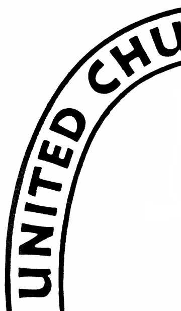
 One of the reasons I love typography is that it is one of the sources of art and design that nearly everyone sees and at some level appreciates. I was looking at the work of German calligrapher and typefounder Rudolf Koch (1876-1934) and recognized the hand (or at least the influence) behind the the legend on the United Church of Christ “cross and orb” logo. See a detail of this logo to the right. (Official UCC logo page)
Which makes me think that we might go back to Koch’s work to find concordant typefaces and art for some UCC churches, associations and conferences, especially now that the intellectual rights on Koch’s work has expired in Germany and homages and memorials (like this one) have been made to him. Why go back, rather than find faces that are currently popular? Because your works will look dated very fast.
The legend typeface looks quite a bit like, but is not a perfect match to, Koch’s “Neuland” face, which itself had several versions. A German type foundry still has rights to the name “Neuland” so Manfred Klein issued his interpretation under the anglicized name “New Country.” A sample of this is seen below, and the face may be downloaded here.

But perhaps that’s too Jurassic Park or American Spirit cigarettes for you. (Both drew on Neuland.) Koch’s Holla face, again interpreted by Dieter Steffmann, might suit better. I confess I like its retro feel. Perhaps for some nice Midwestern Evangelical Synod-heritage church? (Download here. Check out Claudius, too.)
 Either way, I’d also get Koch’s dingbats and symbols fonts — his work on the subject of symbols is still in use and in print.

Rudolf Koch was a devout Christian, and he drew a number of Christian symbols that he asked be made available for public use after his death. His publisher complied and may be seen and downloaded here. I like the ones drawn with broad strokes, and I think would complement the UCC logo in locally-produced pamphlets.
 One of the reasons I love typography is that it is one of the sources of art and design that nearly everyone sees and at some level appreciates. I was looking at the work of German calligrapher and typefounder Rudolf Koch (1876-1934) and recognized the hand (or at least the influence) behind the the legend on the United Church of Christ “cross and orb” logo. See a detail of this logo to the right. (
 Either way, I’d also get Koch’s dingbats and symbols fonts — his work on the subject of symbols is still in use and in print.